We have known for a litttle while now that the Tampa Bay Lightning have been planning a slight logo tweak to coincide with the NHL's leaguewide release of the new, sleeker, Reebok designed uniforms this season. The team colours and basic design of the uniforms is to stay the same, which is good. I like our colours.The change is supposedly just a little bit of a twist on the logo, or so we're told. Well...
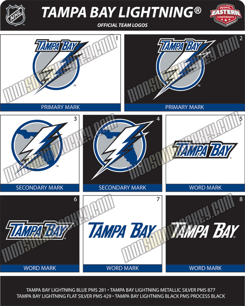
As many of you know, I care a great deal about sports uniforms and colours. I think they are of vast importance, are the foundation of the identity of a team or school, and don't get enough attention paid to them by most people. There are, however, others like me, which is how I know about a uni-dedicated website called uniwatchblog.com. It's one of my favorites, and its author, Paul Lukas, also does a bi-weekly column on espn.com. Anyway, the Lightning are scheduled to unveil their new stuff at "Ice Fest" in August. But Uni Watch claims to have its hands on the new look logo already, and posted the design yesterday. If, and I STRESS IF, this is correct, the new look Tampa Bay Lightning...
...will look like this.
I have to say, I really, REALLY hope this is all just a mistake, and that the new marks are something else. As of right now, this is all preliminary, and it's certainly possible that bad intelligence is to blame and that this won't be the design after all. But if it is....my god.
I really don't know where to start here. This is supposed to be a simple change. If anything, they should have just taken the word "Lightning" out of the old logo and left everything else the same, or even if they wanted to tweak the letter font for "Tampa Bay", fine, but not to this. I really dislike the lightning bolt on this new one, too, much too pointy and the way it's half white and half blue just doesn't work. And the state of Florida on the secondary logo is waaaaaaaay too jagged looking. It wasn't that way in the old one and I don't know why it needs to be changed. The state doesn't look like that at all. And the proposed lettering font with the big serifs, espeically the one on the "B" in "Bay", I mean, I'm speechless. This has to be a mistake, right?
Well, it very possibly could be. Upon seeing these mock-ups, I immediately contacted my guy with the Lightning, who will remain nameless here. Let it suffice to say that he is as dependable and trustworthy as can be, and wouldn't jerk me around. He said that he is not allowed to talk about the new logo, which I respect. But when I e-mailed him back with a diatribe on how bad I think this proposed one looks, he simply replied back:
"You are assuming pretty strongly that these are actually the new marks."
I didn't press him any further. I don't know about you, but it sounds like a glimmer of hope still exists to me. At least for now, it's all we have. We'll see in August.